

OEM Kraft Paper Box Custom Design Tips for Stunning Unboxing Experiences
2026-10-10
Unboxing starts long before the lid lifts—it begins with the first touch of kraft paper, the sound of a tear strip, the reveal of a printed logo. For OEM kraft paper boxes, custom design is less about decoration and more about engineering a feeling. In this guide, we share practical tips to make your packaging stand out on camera, in hands, and in memory. If you're looking for a partner who understands structure, print, and finishing as one system, Kuaijie Carton is ready to help.
Start With the Sound of the Box Opening
There’s a particular crack when the tape lets go—half tear, half whisper—and it arrives before you ever see the thing you ordered. Not the dull thud of a dropped parcel, but the sound of a seal giving way. Cardboard flexes, a flap lifts, and for a second the room holds its breath. That tiny rupture is the true unboxing, the moment anticipation stops being abstract and starts having texture.
You’ve heard it a hundred times: the gritty slide of a sleeve, the soft pop of a magnetic lid, the crinkle of tissue paper still settling. These noises aren’t accidental. They’re the first physical dialogue between you and whatever sits inside. A box that opens too easily feels disposable. One that resists just enough—without frustrating you—turns a routine delivery into a small ceremony. The sound becomes a promise that someone thought about the seconds before the reveal, not just the product itself.
Most companies obsess over the look of the package. Few treat the opening as a designed moment. Yet changing the adhesive’s tack, the density of the board, even the angle of a perforation shifts the acoustic signature. A sharper rip reads as fresh. A lower, slower tear suggests weight and care. Get that first note right, and the object inside doesn’t just appear—it arrives with a quiet authority.
Give Kraft Paper a Tactile Upgrade
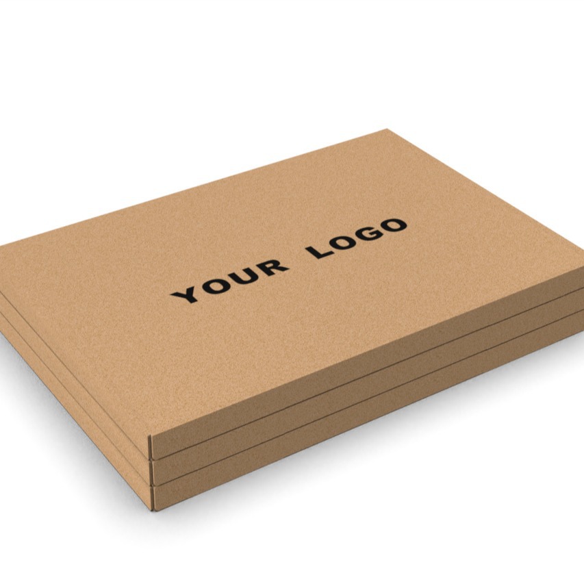
When you run your fingers across ordinary kraft paper, the experience often stops at rough and unremarkable. A tactile upgrade changes that first impression entirely. By introducing subtle embossing patterns, soft-touch coatings, or a lightly sanded surface, the paper gains depth that invites people to keep touching it.
Think of it as adding a handshake to your packaging. A linen-like texture or a gently raised geometric motif turns a simple sheet into something memorable. These finishes don't just look different; they create a physical conversation between the material and the person holding it.
The best part is that this kind of upgrade works without shouting. It's a quiet detail—felt more than seen—that makes kraft paper feel less like a commodity and more like a deliberate choice. Even a small change in grain direction or a matte varnish can shift the entire perception from disposable to durable.
Use Custom Inserts to Stage the Product Like a Scene
Give your product a stage, not just a slot. Custom inserts let you arrange each item like a set designer arranges props—creating depth, leading the eye, and framing details that might otherwise go unnoticed. A slight lift here, a nested tray there, and the unboxing feels like opening the curtain on a small, intentional world.
Think beyond plain foam cutouts. Layered paper, molded pulp, or even fabric-lined cavities can hold accessories at different heights and angles. This kind of arrangement doesn't just protect the contents; it tells a visual story before a single word appears. The insert becomes part of the product's personality, whether that's rugged, elegant, or playful.
Small adjustments make a big difference. Tilt a bottle so the label catches light, place a cable in a coiled groove, or tuck a manual underneath so its cover peeks out. When you design the insert with the customer's first glance in mind, you turn the packaging into a quiet performance—one where the product is always the main character.
Hide a Small Detail Inside the Lid
Most people lift a lid without thinking twice, and that’s exactly why it’s a good hiding place. A tiny sketch, a date, or a short phrase tucked onto the inner face stays invisible until someone tilts the piece just right. The trick is to make the detail feel like a reward for curiosity, not a decorative afterthought.
Positioning matters more than size. Place the detail near the hinge or along the underside rim, where a thumb naturally pauses but the eye rarely focuses. If you’re working with a recessed lid, use the depth to create a small shadow line; if the surface is flat, keep the mark light enough to read only in direct light. Avoid centering the detail too boldly, because then it competes with the outside instead of waiting to be found.
Material shapes the reveal. A burn stamp on maple or cork leaves a soft, dark impression that feels handmade. A fine laser etch on brass or steel catches a glint when the lid is opened at an angle. Whichever you choose, test it with the same motion someone would use to open the object—rotate, lift, tilt—and adjust until the hidden detail appears in that one ordinary moment.
Make the Box Fit Like a Glove, Not a Shipping Box
A package that arrives looking like a bloated cardboard beast rarely feels intentional. When the box is several sizes too large, the product rattles inside, the padding becomes the main event, and the unboxing moment turns into a dig through crumpled paper. The fix isn't about cutting costs on materials—it's about respecting the object you're sending. A snug fit lets the item sit still and arrive as if it were placed, not dumped.
Think of the box as the first physical touchpoint, not an afterthought. If you're shipping a slim notebook, a flat mailer or a low-profile box beats a cube with air pockets. For oddly shaped items, custom inserts or scored cardboard can cradle the edges without excessive bulk. The goal is to make the packaging feel like a second skin: close enough to protect, tight enough to keep everything in place, and never so roomy that the product gets lost in transit.
Customers notice when a brand has taken the time to match the box to the item. It signals care, reduces waste, and makes the whole experience feel less like logistics and more like a considered handoff. So before you reach for the standard stock size, hold the product in your hands and ask: does this box move with it, or does it just contain it? The difference shows up the moment the tape comes off.
Design for the Box’s Second Life
A box rarely earns a second thought once it's emptied, so designing for its next chapter means building in clues—fold lines, cut guides, or printed instructions—that invite someone to turn cardboard into a drawer organizer, a playhouse window, or a tray for seedlings. The more obvious the transformation, the more likely it actually happens.
Material choices do a lot of quiet work here. Coatings that resist a bit of moisture, inks that stay legible after bending, and structural scores that don't weaken after repeated folding all help the box survive past its first delivery. Small touches like perforated tear-away panels or pre-marked cut paths turn a passive container into a starting point, not an ending.
The goal isn't to force every box into one afterlife, but to leave the door open. When the design respects both the product it protects and the person who receives it, a second use stops being an afterthought and starts being part of the package's story.
FAQ
Map out the entire opening sequence from the moment the customer sees the outer surface. Think about the first touch, the resistance of the box lid, and the layer right under it. Kraft paper has a raw, tactile quality, so let that guide your material choices instead of fighting it with overly glossy finishes.
Focus on small contrasts. A debossed logo, a single-color screen print in white or black, or a custom tape strip in a muted tone can do a lot. You can also line the interior flaps with a different texture or add a simple paper wrap around the product. The goal is to make the box feel intentional, not decorated.
Screen printing gives you solid, slightly raised ink that sits nicely on the rough surface. Foil stamping works if you want a metallic accent that catches light without being loud. Avoid full-coverage digital prints because they often look washed out or crack along the fold lines. One or two spot colors tend to look sharper and more deliberate.
Try a double-tuck lid that reveals a patterned interior, a tear strip that opens cleanly with one pull, or an insert tray that slides out sideways. Even a small leaflet tucked into a corner pocket adds a moment of discovery. The surprise doesn't have to be complex; it just has to break the expectation of a standard shipping box.
Match the weight to what's inside. For lightweight apparel or accessories, a 300 to 350 gsm board gives enough structure without feeling rigid. For heavier items like glass or ceramics, move up to 400 gsm or add a corrugated inner sleeve. Always test the fold lines with your actual product weight because a box that buckles under pressure kills the unboxing moment.
Place a simple message on the underside of the lid, like a short brand line or a care note. You can also layer the opening: a tissue paper wrap first, then a small card, then the product itself. Keep the sequence short but noticeable. The pause between layers is what builds the feeling of a ceremony rather than a chore.
They overstuff the design with colors and logos until the kraft texture disappears. Or they choose a box that is too tight, forcing customers to rip it apart. Another common issue is ignoring the interior, leaving it plain and dusty-looking. The best OEM designs respect the material's natural look and add just enough contrast to make the product stand out.
Pick one design anchor that means something to your brand and repeat it sparingly. It could be a hand-drawn icon, a specific shade of ink, or a phrase placed in an unexpected spot like the bottom flap. Let the kraft surface function as a neutral background. When every element has a reason to be there, the box feels personal instead of off-the-shelf.
Conclusion
The first impression of a custom kraft box often happens before the product is even visible. A crisp, deliberate friction when the lid slides or lifts sets a tone that flimsy packaging can never match. To build on that, consider how the surface feels under the fingertips—soft-touch coatings, a light deboss, or a subtle linen texture turn ordinary brown kraft into something worth holding. Inside, custom inserts do more than prevent movement; they frame the product like a prop on a miniature stage, guiding the eye to what matters most. Die-cut trays, molded pulp, or folded cardstock can create levels and niches so each component has its own place, encouraging a slower, more intentional reveal instead of a jumble. Even the initial resistance of the lid can be tuned—too loose feels cheap, too tight frustrates, but the right friction reads as intentional craftsmanship.
Small surprises hidden under the lid—a printed message, a foil-stamped icon, or a tiny illustration—reward the person who looks closely. Equally important is sizing the box to the product so there is no wasted space or clumsy filler, making the unboxing feel tailored rather than generic. A snug fit also prevents rattling during shipping and adds a sense of quality control. Finally, design the box for what comes after the reveal: a rigid structure with a removable tray or a fold-flat design can live on as storage, gift wrapping, or keepsake, which extends the brand moment long after the first open. When the box earns a second life, every reuse quietly reinforces the brand without saying a word.
Contact Us
Contact Person: Tan Xiang
Email: [email protected]
Tel/WhatsApp: 8613798906863
Website: https://www.dgkjzx.com