

Vintage Printed Carpet: Premium Quality and Enduring Style
2026-09-23
A vintage printed carpet isn’t just another floor covering—it’s a layered piece of history that refuses to follow trends. The faded motifs, the subtle color shifts, the quiet confidence of a pattern that has already stood the test of time: these are the details that turn a room into a home. At Senseco, we’ve built our vintage printed carpet collection around exactly that idea—premium quality that lasts, and a style that never feels dated. But what really separates a genuine vintage aesthetic from a cheap imitation? Read on to find out why the right carpet can change everything.
Why Vintage Printed Carpets Feel Impossible to Ignore
The moment one of these rugs crosses your sightline, it pulls you into a kind of quiet time travel. Faded dyes and hand-knotted irregularities carry the weight of rooms that no longer exist, yet the print keeps those ghosts vivid. It's not just decoration—it's a floor you could read like a diary.
Part of the magnetic pull is the clash between precision and decay. A symmetrical medallion might be half dissolved by sunlight, or a border pattern suddenly blur into a smoky smudge. Those imperfections break the rhythm your eye expects, so you look again, and again, trying to solve a puzzle the weaver never intended to finish.
There's also a strange softness in how these textiles anchor a modern room. Against hard-edged furniture or cold polished concrete, a vintage printed carpet introduces a layer of memory that makes everything else feel less temporary. You don't simply notice it—you feel the room exhale when it's placed.
What Goes Into a Carpet That Lasts Decades, Not Seasons
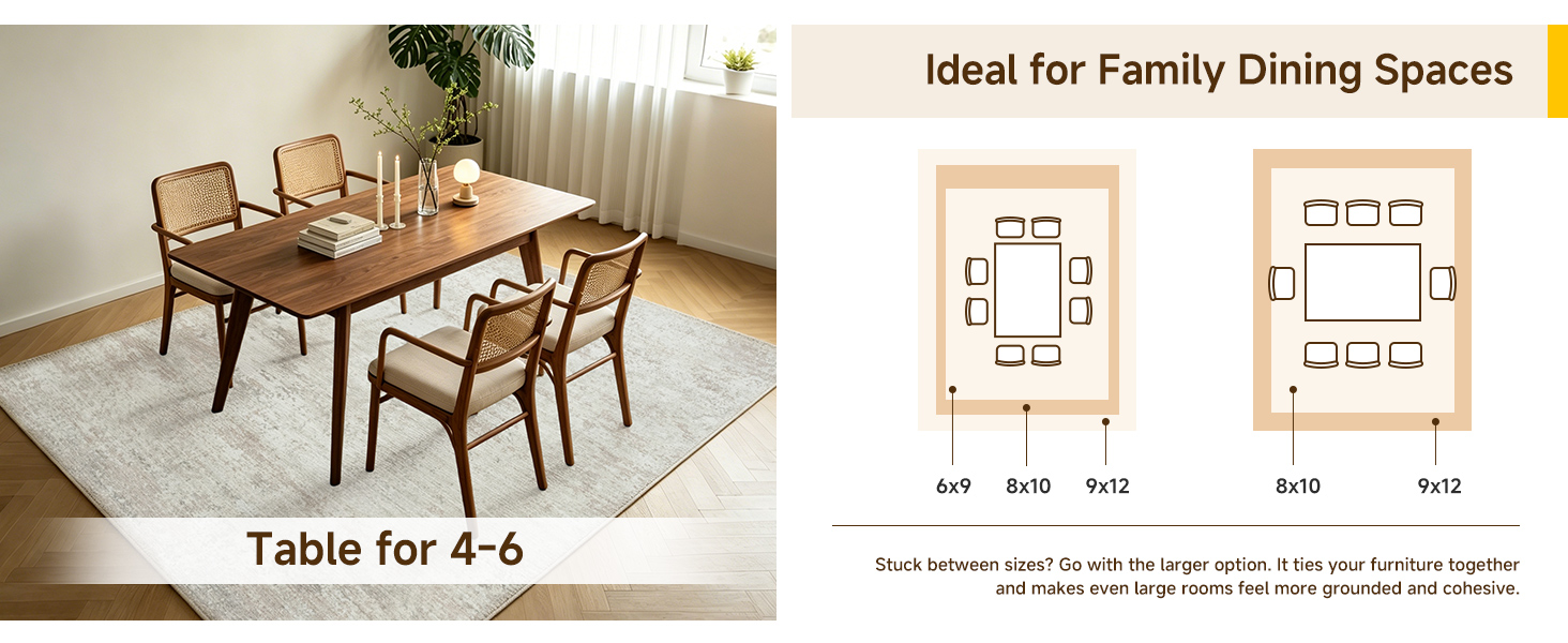
Most carpet failures start long before the first footstep. In a mill, the difference between a floor that still looks intentional after fifteen years and one that mats down by the third spring often boils down to fiber staple length, twist per inch, and how the tufts are locked into the backing. A dense loop or tightly twisted cut-pile made from long-staple nylon or wool resists the slow crush of daily traffic far better than a soft, airy saxony that feels plush for about eighteen months.
Backing chemistry matters just as much as face fiber. Cheap latex breaks down under repeated cleaning and humidity shifts, which lets individual tufts work loose and creates bald patches along stair nosings and sofa legs. Durable carpets tend to use a woven or reinforced secondary backing and a primary backing that holds a tuft with real grip, so the pile doesn't lean permanently after a few years of vacuuming.
Dye method also plays a quiet role. Solution-dyed fibers carry color through the entire filament, which means wear, bleach spills, and strong sunlight don't expose a paler core the way surface-dyed yarns do. That kind of color integrity keeps a ten-year-old carpet looking intentional rather than apologetic, especially in rooms with big windows or a dog that prefers the same spot by the door.
How to Read the Patterns Without a Design Degree
You don't need a formal design education to start seeing the patterns that hold visual work together. Begin by training your eye to notice repetition and contrast. Look at a page, a room, or a poster and ask what repeats: Is it a color, a shape, a spacing rhythm? Then ask what breaks that repetition. Often the break is the most important part—it's where the designer is pointing your attention.
Another trick is to trace the invisible lines. Every layout has an underlying grid or alignment, even if it's loose. Use a finger or a piece of paper to mark where elements start and end. When you see that a title, an image, and a button all share the same left edge, you're reading a pattern of alignment. Once you can name a few of these moves—repetition, contrast, alignment, hierarchy—you start to decode why some things feel calm and others feel busy.
Practise on things you already like. Grab a magazine spread or a well-designed app screen and write down three patterns you notice. Maybe the type sizes step down in a predictable way, or the color palette stays within one family. The goal isn't to memorize theory but to build a habit of looking with curiosity. Over time, these observations become a mental library you can draw from, no degree required.
Making Old-World Prints Work in Modern Rooms
Old-world prints often conjure images of dusty parlors, but they can bring a surprising depth to a contemporary space when handled with a light touch. Instead of matching them to heavy, dark furniture, pair a faded botanical engraving or a sepia architectural etching with sleek, low-profile seating and uncluttered walls. The contrast between centuries-old linework and clean-lined modern pieces makes the room feel curated rather than cluttered.
Scale matters more than subject. A large antique map or oversized plate from a natural history folio works as a bold focal point above a minimalist sofa, while smaller prints shine in a tight grid hung over a slim console. Let the frames stay simple—thin metal or natural wood with a matte finish—so the paper's age and texture do the talking. Skip ornate gilding; it tends to fight with modern lighting and flat surfaces.
Finally, use one or two related prints rather than a full wall. A single well-chosen engraving above a bed or a pair of matching lithographs flanking a large window creates rhythm without turning the room into a gallery replica. The goal is to borrow the quiet confidence of old printmaking, not to recreate a period set.
The Hidden Details That Separate Premium From Mass-Produced
Premium isn't about louder branding; it's about the quiet choices that never make the tag. Take a collar, for instance. On a mass-produced shirt, the collar points are cut from a single layer with fused backing that eventually curls. A premium version pieces the collar with a slight curve along the outer edge and hand-bastes the interlining, letting the fabric roll instead of crease. That tiny difference means it sits flat after a dozen washes.
Hardware often gives it away faster than fabric. A premium zipper has teeth that are individually buffed before plating, so the pull doesn't rasp or catch. The slider is weighted to fall cleanly against the tape instead of sticking at an odd angle. Even the snap buttons are set with a small leather washer behind them, which stops the prong from tearing through after repeated use. Mass production skips those steps because they add minutes and materials, not because they are invisible.
Stitch count matters, but only up to a point. What truly separates premium work is how the seams are planned. A well-cut sleeve is sewn with the fabric's natural give in mind, so the seam allowance is shaved to different widths along the curve—wider at the shoulder, narrower at the underarm. This stops puckering when the arm moves. Premium makers also back-tack at stress points, not just at the ends, and they choose thread that shrinks at the same rate as the shell fabric. These details are easy to skip when you're rushing to fill a container.
Simple Habits That Keep Vintage Colors Looking Fresh
Vintage colors fade fastest when they're left in the same bright spot day after day. Rotate rugs, cushions, and framed prints every few months so no single side takes all the sun. Even sheer curtains can soften harsh light enough to slow the loss of those muted ochres and dusty roses.
Dust may seem harmless, but it holds moisture and tiny abrasive particles that dull surface dyes over time. A gentle weekly pass with a soft, dry cloth or a low-suction vacuum keeps textiles and painted finishes from turning muddy. Skip the polish and harsh sprays—they often strip the very patina you want to preserve.
When you store seasonal pieces, wrap them in undyed cotton or acid-free tissue instead of plastic bins. Trapped humidity and chemical off-gassing can yellow fabrics and warp paper. A cool, dry closet with a little breathing room does more for those faded teals and mustard yellows than any restoration trick.
FAQ
It uses a dense flat-weave base made from a wool-cotton blend, then applies pigment in thin layers to mimic natural sun fading. The edges are hand-serged rather than machine-locked, so the whole piece sits flatter and wears more evenly.
No, the fading is printed into the yarns before weaving, not applied as a surface finish. Even after vacuuming and foot traffic, the color distribution stays consistent because the pattern is part of the fiber structure.
It handles those spaces well. The pile is low but tightly packed, which prevents dirt from grinding into the base. We have had customers use it under rolling chairs and pet beds without visible matting within the first year.
The face is 80% wool and 20% cotton for stability. The printing ink is water-based and free of heavy metals. A thin latex backing is added only to prevent slipping on hard floors, but it can be removed if you pair the carpet with a separate pad.
Vacuum without a beater bar once a week. For spills, blot with a damp cloth and a drop of dish soap, then rinse by pressing with a wet cloth. Avoid steam cleaners and dry-cleaning solvents, as they can react with the water-based pigments and cause slight darkening.
It works surprisingly well in rooms that mix eras. Try it under a mid-century coffee table with linen upholstery, or in a dining room with black steel chairs and raw wood shelves. The muted palette keeps it from competing with bold wall colors.
Several patterns are redrawn from 19th-century Anatolian and Persian flat-weave fragments. Others are composite designs built from border details and medallion shapes found in archival photos, but recolored to match modern low-saturation palettes.
Conclusion
There is a reason vintage printed carpets keep pulling attention the moment someone steps into a room. The colors carry a depth that feels collected rather than manufactured, and the patterns borrow from eras when ornament told a story. But the real appeal is not just nostalgia; it is the way a well-made piece refuses to fade, flatten, or fall apart after a few seasons. The foundation usually starts with tightly knotted or densely woven fibers that take dye unevenly just enough to create a softly lived-in look. That subtle irregularity also means you do not need a design background to read the motifs: border lines guide the eye, central medallions anchor the space, and repeating floral or geometric shapes create rhythm without shouting. Premium versions layer these details with a slight sheen variation that catches light differently across the day, while cheaper prints look flat and one-note.
Making these old-world prints work in a modern room is easier than it sounds. A faded Persian-inspired design can sit under a minimalist sofa without turning the space into a period set, especially if you echo one accent color from the rug in a cushion or a throw. The trick is to let the carpet be the most decorated element while keeping surrounding surfaces quiet. Beyond style, the premium difference hides in the back and the edges: hand-serged or tightly bound sides, a sturdy cotton foundation that does not ripple, and dyes that penetrate rather than sit on top. These are the details you notice years later when the colors still hold their warmth. To keep that freshness, vacuum with a soft brush head, rotate the rug every few months to even out sun exposure, and blot spills immediately with a dry cloth instead of rubbing. A little care preserves what makes these carpets feel alive long after trends move on.
Contact Us
Contact Person: Ivy Yin
Email: [email protected]
Tel/WhatsApp: +86 18519681805
Website: https://www.sensecomarketing.com/